Adjusting granulation (and more . . .)
On the weeks in-between: recommendations, short answers, handy tidbits, housekeeping, business stuff and behind the scenes . . .
I plan to keep publishing the regular newsletter on the same schedule as before—every 2-3 weeks. This isn’t the second installment of our series on planning just yet; that will come out next week on the regular schedule.
But there are a lot of other things I’ve wanted to share that are digressions from the series on planning, like studio hacks, or solutions to problems I’m addressing in my own work that you might find useful, too. So, I’ve decided to occasionally publish something on the in-between weeks.
Adjusting granulation
I normally use a lot of granulating pigments, but sometimes I’d like to coax a bit more out of them, and other times, I’d prefer to have less granulation. Is there any way to adjust granulation? Yep. Here are some ideas to try.
First, what is granulation?
For those new to watercolor, granulation (a.k.a. sedimentation) is the speckly or mottled appearance produced by some watercolor pigments as they dry. Some common examples:
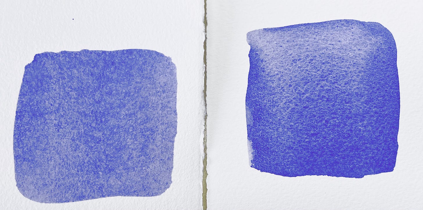
cobalt violet, cobalt blue, cobalt turquoise/teal, and cobalt green
ultramarine violet, ultramarine blue-violet, and ultramarine blue
cerulean blue
raw sienna & burnt sienna
viridian

Some granulating pigments are more granulating than others.

Also, manufacturers can somewhat enhance or diminish the amount of granulation of a particular pigment by how they grind the pigment and formulate their paint.

Ways to enhance granulation
Some paint brands emphasize granulation
Different manufacturers target different tastes with their color lines, so people who love a lot of granulation often gravitate to brands that try to enhance their granulating pigments. Some to try: Daniel Smith, M. Graham, and Stephen Quiller’s signature line from Jack Richeson. Daniel Smith has a large selection of unusual mineral colors (which are often granulating).
However, there are plenty of lovely colors with lots of granulation in other color lines, too, so trying different brands is an expensive, and rather scattershot, way of enhancing granulation, but it’s worth keeping in mind as you choose paints.
Try a different type of paper
Within a given brand and weight of paper, rougher paper shows more granulation. So, 140-lb Arches Rough will show more granulation than 140-lb Arches Cold-Pressed, which will show more granulation than 140-lb Arches Hot-Pressed.
But other characteristics of paper (especially absorbancy) also affect granulation, so there’s no simple rule. Sometimes a paper that is smoother promotes more granulation than a rough paper of a different brand. There are too many types of paper for me to test them all and report how they affect granulation. But one paper I use sometimes—Saunders Waterford—seems to promote more granulation than other papers that feel even rougher, so that one might be worth a try if you want more granulation.

Slow down drying
Granulation develops slowly as the paint dries, so one of the best ways to enhance granulation is to slow down the drying of your washes.
Increasing the humidity in your studio by using a humidifier helps, especially in arid climates. But a simpler method is to thoroughly wet the back of the painting before you start painting. When I’m doing this, I usually just wet the entire back and let the paper stick to the support by surface tension.
Use plenty of water to wet the back, and allow a little time for the water to be absorbed and the paper to flatten out. The water you add to the back slows drying of the wash, but does not dilute your wash or result in soft edges (as it would if you added it to the front surface).
One caution: If you leave the paper to dry with a lot of water still on the underside, you may get blooms along the outer edge. You can't use a hair dryer to prevent blooms, because you’re trying to let it dry as slowly as possible. Instead, wait just until there is no longer any visible water on the front, then carefully pick up the painting and lay it on a dry surface to finish drying. The excess water mostly stays behind on your painting support.

Note: Even better for preventing unwanted blooms along the edge is to transfer the painting to one of those “pee pads” for training puppies (like these). Unlike a towel, they immediately trap liquids under the surface layer, which stays mostly dry to the touch, so you don’t smear wet paint around.
(They’re disposable, but for painting, you can hang them up to dry and re-use them. I usually get at least 6 months’ use out of each one.)
Adding a contrasting, non-granulating color
This is the trick behind Schminke’s “super-granulating” colors. Each of those colors combines a granulating pigment with a contrasting non-granulating color. As the mixture dries, the granulating color collects into little dots, as usual. The non-granulating color tints the paper in between the little dots. There’s not actually more granulation, but since the paper is now tinted a contrasting color, the granulation becomes a bit more noticeable. The more color contrast, the more noticeable the granulation becomes, but even a little can be a nice subtle enhancement.

Choose a fairly transparent color for the contrasting non-granulating color. Opaque colors sometimes float on top of both the paper and the speckles of granulation, which mutes the effect.
What about granulation medium?
This works, but for most pigments, the pattern of granulation it produces is different from the pattern you get with most naturally granulating colors.
However, it’s the only way I know of to get granulation out of pigments that don’t granulate naturally. I tend not to use it much because it’s not a pattern I often find a use for. But that’s just me. You might love the look, or have the perfect situation to use it.
Ways to minimize granulation
Substitute a non-granulating paint (or paint mixture) in a similar color
You may not be able to find an exact match for brighter colors, but many of the washes we actually use are somewhat neutralized. So, instead of trying to exactly match the granulating color, just worry about trying to match the target color you’re trying to mix. That’s often easier.
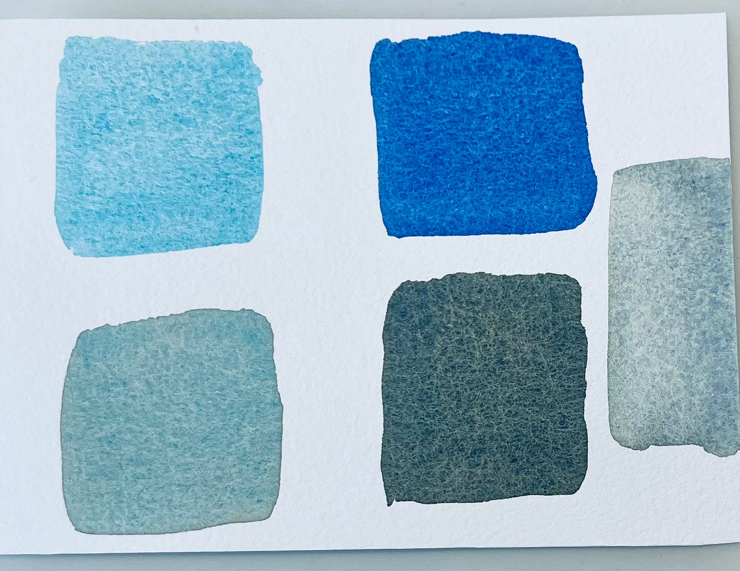
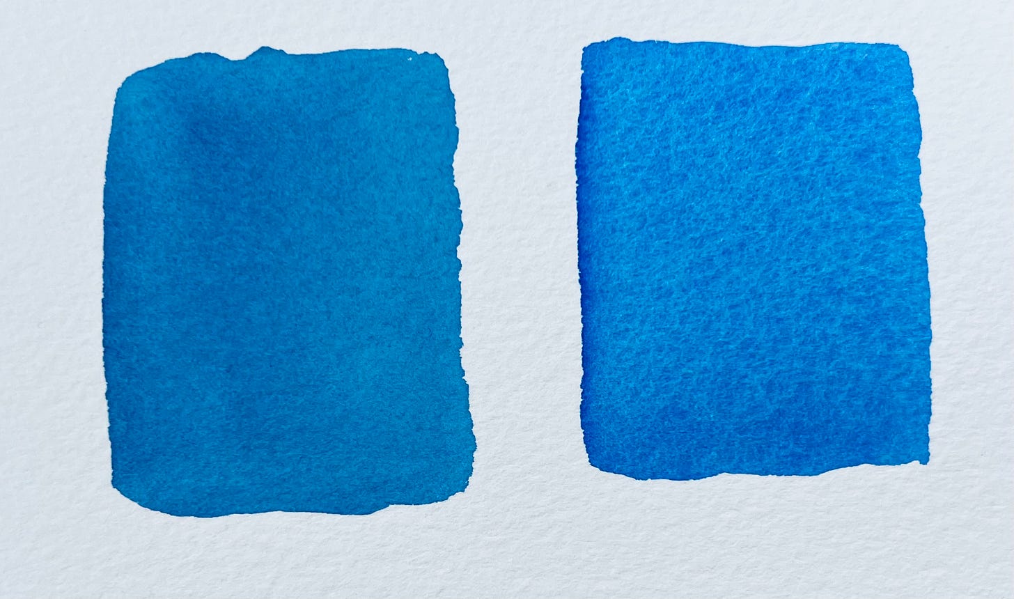
For example, the phthalo blue red shade (below left) is close in hue to the cobalt blue on the right, but slightly less saturated. If you were using the cobalt blue to cool a skin tone and wanted a non-granulating substitute, it wouldn’t matter that the phthalo blue is a little less saturated. You’d just be using it to tone down a fairly neutral color, anyway.
Even for a blue sky, cobalt blue is often a bit too saturated, so many people add a tiny touch of raw ochre or burnt sienna to slightly neutralize cobalt blue when using it for a sky. So it’s not a problem that the phthalo blue is not as bright.
Use a hair dryer
The best way I know to minimize granulation is to use a hair dryer to speed up drying. When you do this, it helps to gently agitate the wash by wiggling the hair dryer rapidly, while moving quickly and evenly over the entire surface.
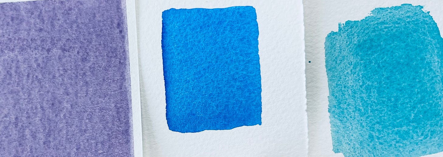
The photo below shows a swatch of cobalt teal dried with a hair dryer on the left, compared to a swatch painted on dry paper (middle) and a swatch where we wet the back first (right). This shows how we can manipulate the same pigment to have no granulation, or the usual amount, and more than usual, by manipulating the drying speed.
Mix in a bit of white watercolor (or gouache)
If you are laying a wash over a larger area, or your climate is very arid, you may have a hard time getting back to dry it with a hair dryer before some granulation starts to occur. Another trick to minimize granulation is to mix in a bit of white watercolor (or gouache). Each pigment (and brand) is a little different, so you’ll need to do a bit of testing to figure out how much white to add, but it usually doesn’t take very much. You can use either titanium white or zinc white (Chinese white).

That’s it for my bag of tricks for adjusting granulation. Do you know another? Add it in the comments!
Why I’m no longer making paint-alongs or step-by-step project videos
A frequent question in my inbox is “When are you going to get back to making more paint-alongs (or project tutorials)?” I’ve tried to refrain from using newsletter space to talk about business decisions, but it’s getting a little silly to keep answering this question for one person at a time.
I know some of you found me during the pandemic and perhaps got the impression that those postcard paint-alongs were “what I do”. You might be hoping this stuff I’ve been publishing about designing your own paintings and finding your own style is a digression, but it's the other way around. Those postcard paint-alongs were just an attempt to do something to soothe our stress during those initial covid lockdowns.
I realize paint-alongs can be a relaxing pastime—that’s what made them good for the covid lockdown—and you can learn some things from them. But there is no shortage of paint-alongs, step-by-step tutorials, and painting demonstrations in the world. Many people really enjoy making this sort of content. I’m not one of them.
At the same time, they’re are very few people trying to create online resources to help you learn to design and plan your own watercolors, or find your own watercolor style and voice. It’s not that no one else is teaching this stuff, but it’s really hard to teach or learn in a self-study format. There’s no simple formula that applies to every artist and every painting. You usually pick it up a little at a time from face-to-face interactions with teachers, mentors and fellow artists, talking over projects you’re working on.
If you’re learning online, live in a remote area, or have mobility or transportation challenges, you may not get many of those face-to-face interactions with other artists. Not everyone has classes available to them, and not everyone has the time or budget for small-group or one-on-one coaching. So, I’ve spent the last ten years or so trying take some of the tools I share with students in my classes and coaching sessions, and turn them into tools you can use to coach yourself (as every artist must do eventually, anyway). I care a lot about this work. It’s hard—to teach and to learn—but it’s worth the effort.
Every yes is a no to everything else you could have been doing with that time and energy. I’m saying no to paint-alongs because I want to say an enthusiastic and dedicated yes to doing my best to help you become your own coach and make the art only you can make. I don’t want to make little clones of myself; I want to share the creative ferment of a group of artists wrestling with the challenging work of figuring out what we want from our art and how to get a little closer to what we imagine it could be.
So if anyone is just hanging around waiting for more paint-alongs, I have to be honest with you—not gonna happen. (My feelings will not be hurt if anyone unsubcribes as a result. No reason our interests have to align for all eternity. :) )
One other thing: if you’re thinking, “I want to make my own art, but I’m not ready. I need to learn a whole bunch more watercolor technique first,” I hope you’ll reconsider that assumption. That’s like insisting on learning all the vocabulary before you try to speak a new language. Start with the technical skills you have now. Be brave and take a small step. Order a meal in that new language; learn to design your own simple postcard. Start from wherever you are, say what you can say now, and learn new vocabulary as you go. Art is not a competition; it’s a voyage of discovery and adventure. Let’s travel together!


Hi Barbara. I loved the course so much that I think I will do it again. The last time I filled a whole journal, so I'll start a new one. It will be fun to see what new ideas arise, and how my painting is evolving. I almost always paint outdoors from nature, so as soon as it cools off. I'm thinking September, which does have 30 days. I like to start projects on the 1st. Lynne, if you're reading this, thank you so much for your inspiration.
That was great information about granulation. I learned a lot.
I totally understand about not doing more paint- alongs and how important it is to decide where to best spend our time.
I do want to say how much I loved the 30 day journaling course you did. It provided me with so many tools and ideas. Even without any paint along aspect to it, I would have still found it most valuable. Thank you for everything you do!