Creating a Sense of Depth and Believable Shadows
. . . especially on yellow, orange, pink or red objects . . .
Two weeks ago I promised to create a video to answer this question from Dragonfly Abha Rajan:
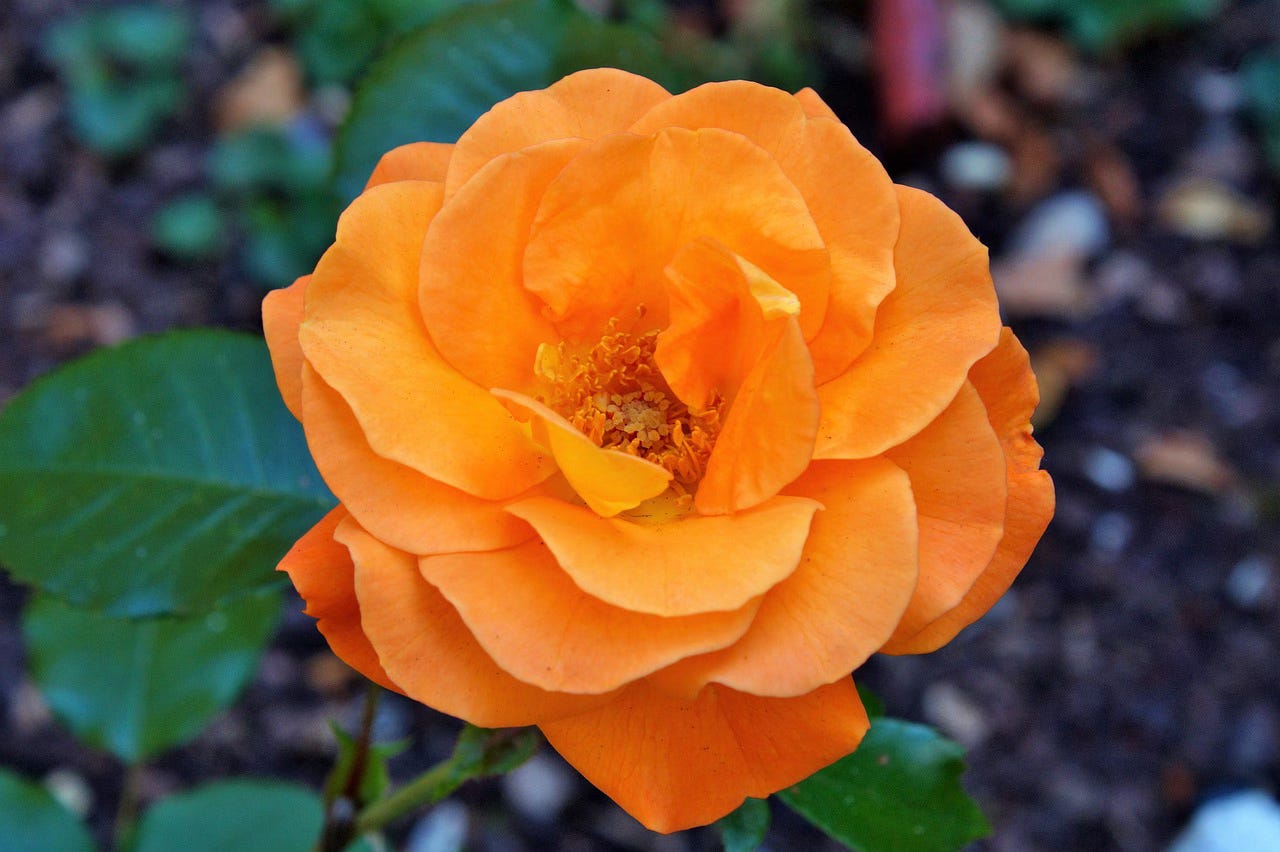
“I am confused about transparent yellows. I am attaching a photo of a rose I was trying to paint. I got it from Pixabay and it is free to use. (photo credit: https://pixabay.com/de/photos/rose-knospen-blüte-rosenknospe-2481043/)
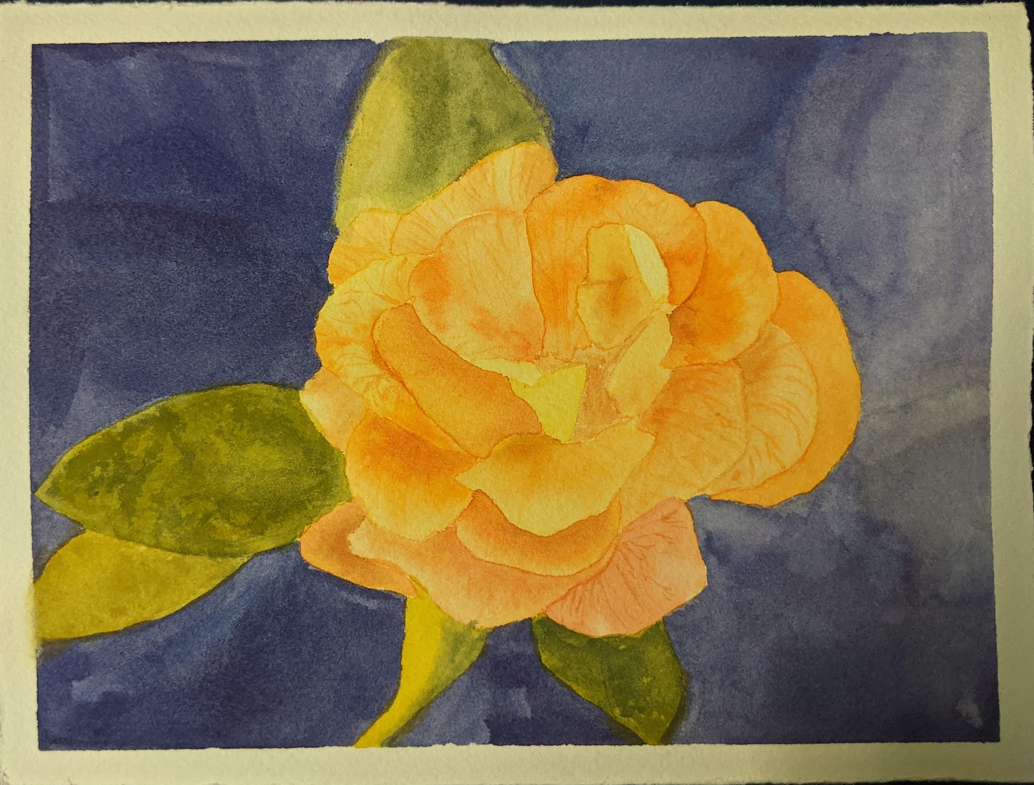
“I am also attaching what I made. It is postcard sized. If you do decide to discuss this topic, please feel free to use my painting if you want to.
“My problem is that my painting looks flat. I was advised to reserve more whites.. but the photo doesn't really have any whites.. Another suggestion I got was that maybe the yellow I was using was too opaque.. and, when I checked, it turned out to be the case. I was using Cadmium yellow pale and Cadmium yellow deep. The red I used also has a high opacity rating. I went and bought yellow colors with a higher transparency rating and I did several tests to compare. I haven't attempted the rose again, but the washes of the similar colors look very similar, as do the oranges when I mix in red. I tried painting over dried black paint, but I can't really tell the difference.
“My thinking is that the problem is that I put in too many layers on the petals. And maybe that's just not such a good idea with such a light color..? Or maybe it's just not such a great picture for watercolor?”
Abha has done a LOT of great problem-solving work on this puzzle, and this painting actually does have quite a bit of depth for this challenging situation. This is a tough problem for painters in all media. But this is one of those things where you can struggle for quite a while, because there’s a secret you need to know that’s not about painting techniques or using the right pigments.
It’s about how vision works.
Our eyes (and the visual parts of our brains) are designed to help us navigate in the world and identify things around us. This means we have to be able to recognize things in many different lighting conditions. So instead of seeing color and value in the abstract, we perceive them in relation to nearby colors and values. Our vision is designed to maintain a constant sense of the color of an object even under changing light. This color constancy means we are able to recognize that a tangerine is orange whether we see it in sunlight, shade, candlelight, incandescent light, fluorescent light, etc.
But it also means that we are sometimes really terrible at telling what color we are actually seeing in a small part of a larger collection of colors.
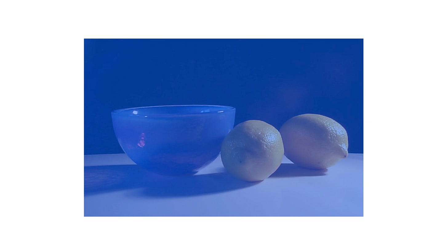
For example, what color are the lemons below? Yellow, right?
Nope. They’re actually a sort of blue-grey (unless maybe your screen has some sort of warm tone applied for nighttime). But if you can’t see them as anything but yellow, rejoice! It means your color vision is normal.
Color constancy has a lot of implications for painters, both useful and annoying. It underlies our freedom to monkey around with color in certain ways, without making viewers unable to recognize what they’re seeing. It’s why “the blue-and-black; no, white-and-gold” dress created such a furor a few years back. It’s why using many different tube greens can still sometimes create a painting where all the greens sort of look alike—not in a good way. (More about all that in some future post, someday.)
But as to today’s question, color constancy also means that we can easily misjudge the small areas of color we’re trying to mix and apply to construct a convincing painting based on a photo or actual scene. It’s why you colors can look exactly right on your palette and your test swatch, but you still don’t get the overall color appearance you want in your painting.
If you’re struggling to mix a color, and you’ve tried all sorts of combos without success, it’s very likely that color constancy is what’s tripping you up. This happens a lot with shadows on colored objects. You’re correctly mixing the color your brain says you’re seeing, but your brain is trying to predict the real underlying color of the object.
So you compensate, by mixing your shadow color darker, because you know shadows should be darker, but you’re not actually seeing or mixing the true darker color in the shadow area. Often it’s not dark enough, sometimes you overdo it and make it too dark. Or it’s dark, but it’s the wrong dark color. And when you put it in the painting, it doesn’t create the effect you wanted: a believable shadow!
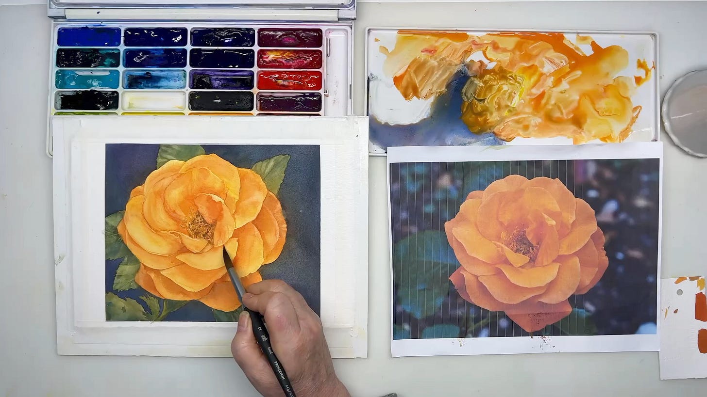
Fortunately, we artists have a secret weapon to deal with this: a hole punch. In this video, I’m going to show you how to use a hole punch to see the color you need to mix, and how to easily arrive at that darker, shadow-y version of bright colors, by using a primary triad and adding a tiny bit of the complement to get the shadow version of your brighter mixtures.
I’m also working from the Pixabay photo Abha provided. As most of you know, I really, really, really don’t like to work from other people’s photos, and I keep urging you to not always work from photos. (I mean “work from” in the sense most people seem to use it: copying the photo, perhaps with some minor changes.)
I’m constantly fussing about this, but I don’t think I explain often enough why I’m fussing. I don’t want to give the impression that using a photo is somehow wrong, or the mark of a novice, or not what a “real artist” would/should do! I use photos all the time. But I’m careful how I use them, because they are both seductive and tyrannical. I’ve seen too many people train themselves in ways they didn’t intend by copying photos as a way to learn and practice, without realizing some of the pitfalls.
I’ve seen too many artists give up and quit in discouragement because of what can happen if you emphasize copying photos without being mindful of what you are training yourself to do (and not do). I don’t want that to happen to any of you!!!
So, the first part of this video is basically me on my soapbox about benefits and potential pitfalls of working from photos. If you can’t stand all that and just want to skip to the demo itself, go to timestamp 10:24 or thereabouts.
“Look Over My Shoulder” Version is Coming
This painting is more involved than what I would usually choose to demonstrate a specific technique. I took about an hour and 40 minutes to actually paint the demonstration painting, so I’ve edited out a lot. I’m sure there will be some questions about things I didn’t mention due to time constraints. I’m working on creating a “looking over my shoulder” version with pretty much everything but the drying time and a little commentary about what I’m thinking, but it will have to be broken into segments for upload and viewing. Look for that sometime in January 2024.
No Newletter on Dec 15 or Dec 22
The Creative Pond will be on winter break for the next two weeks. I can tell from the open rate on recent newsletters that everyone is busy and few have time to read or watch, much less paint. I need time to reflect and plan (and paint!); you need time to reflect and plan (and paint!).
I’ll be back on Dec 29 to talk about some exciting (I hope!) new Dragonfly activities in 2024, the whole New Year’s resolutions/permissions thing, and the perpetual challenge of finding time, energy and inspiration to paint.
In the meantime, I wish you peace, comfort and joy at the turning of the year and the gathering of family and friends, and at least a few quiet times to savor the beautiful dark (or long light, if you’re in the southern hemisphere).
Thank you all for making 2023 a great year for me! I can’t tell you how much I have enjoyed once again being able to see your comments, questions, and shared paintings. If you have questions or topics you’d like to see addressed in the coming year, flutter over and drop them in my inbox. I love to hear from you!


Absolutely loved this demonstration. It was so amazing to see how one darker petal below made the rose look 3D. Your painting turned out much more beautiful than the photo!! The information you gave about values was very informative. Did you ever make a longer version of this demo? I'd love to follow it along while I paint.
Thanks so much for this lesson!