Planning a watercolor, part 6: Bringing in other media to create a successful painting
Some situations are inherently difficult to paint with transparent watercolor alone. Bringing in a other media may help you create a successful painting with less struggle.
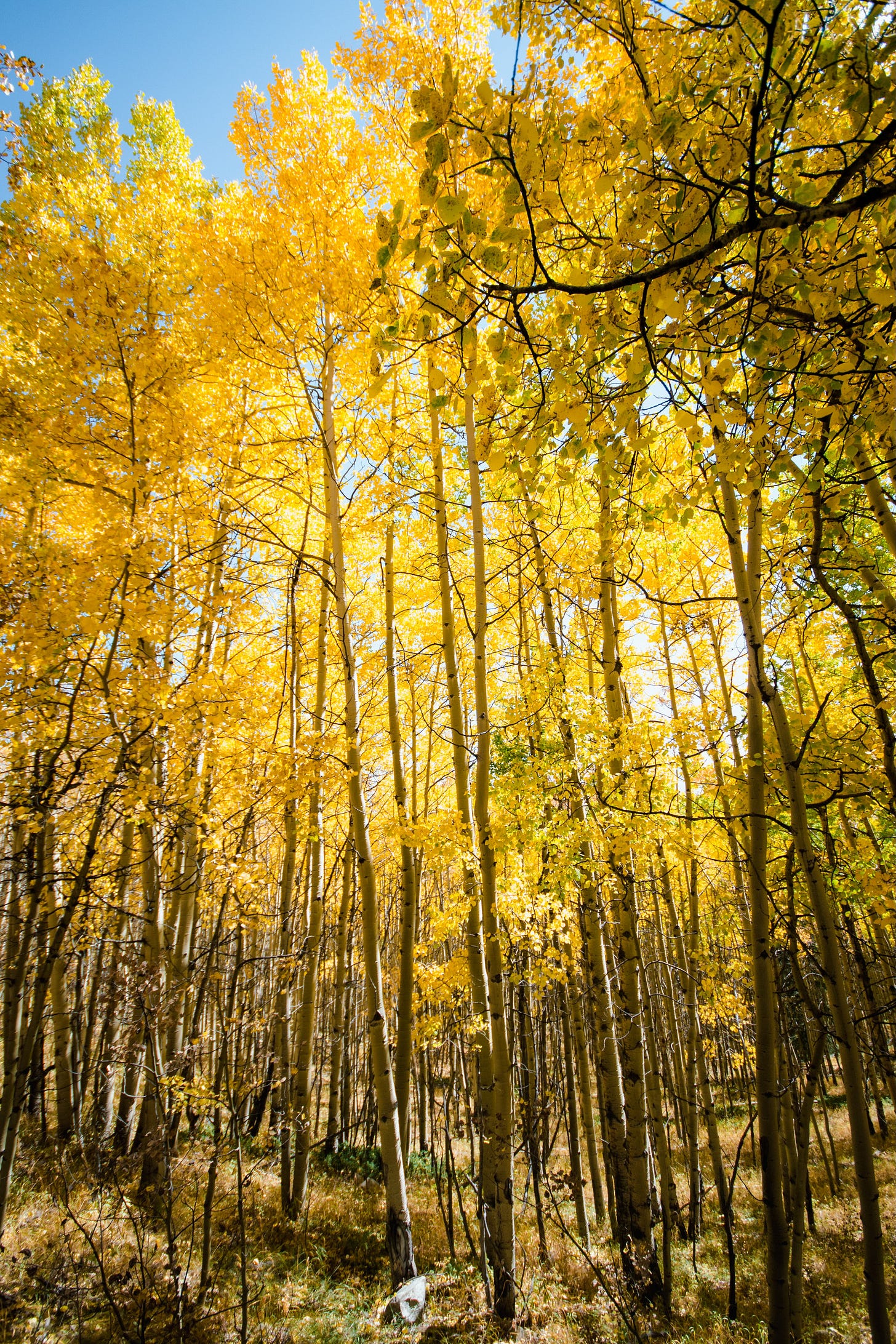
In the last article in this series, we talked about why certain subjects are just inherently difficult in transparent watercolor. For example, if you were going to paint a scene like the one in the photo below, it would be a challenge to handle the broken, raggedy edge between the bright yellow of the leaves and the bright blue of the sky. It’s a challenge to paint all the little bits of yellow leaves in the sky and the little bits of blue sky-holes in the tree canopies without accidentally having the blue and yellow mingle or overlap and create greens that you don’t want along the edge.
Dragonfly Kathy LeVeck shared her solution
If you’re careful to lay your sky wash so that the blue fades away at the top of the tree canopy, and make a wise choice of pigments to use, you might be able to pull it off, as in this serene painting of a golden fall tree shared by Dragonfly Kathy LeVeck (appplause, please!!! 👏):
Kathy says, “The sky looks a bit darker in person and I painted the tree over the blue. Winsor blue red shade works well if you gradate it out quite pale towards the tree crown keep the crown one shape with broken edges. You can deepen the blue in other places in the sky. I could successfully go over the pale sky parts with yellows. I never could do this with Winsor blue green shade.”
Another possible solution: other media
For those of us with a somewhat less deft touch with washes, another possibility might be to bring in some other media to help deal with that edge.
Studio chat next week
Next week is our new monthly feature, the Studio Chat, where I invite you into my studio for an informal conversation about watercolor, how art fits into our lives, and whatever else arises from conversations with students and subscribers that seems worth sharing with everyone. 😁
If you have a question that you’ve been wanting to ask me, leave it in a comment, or hit reply and send it in. (If it’s not something I can address in a Studio Chat, I’ll put it on the schedule for a future article.)
Speaking of questions from Dragonflies . . .
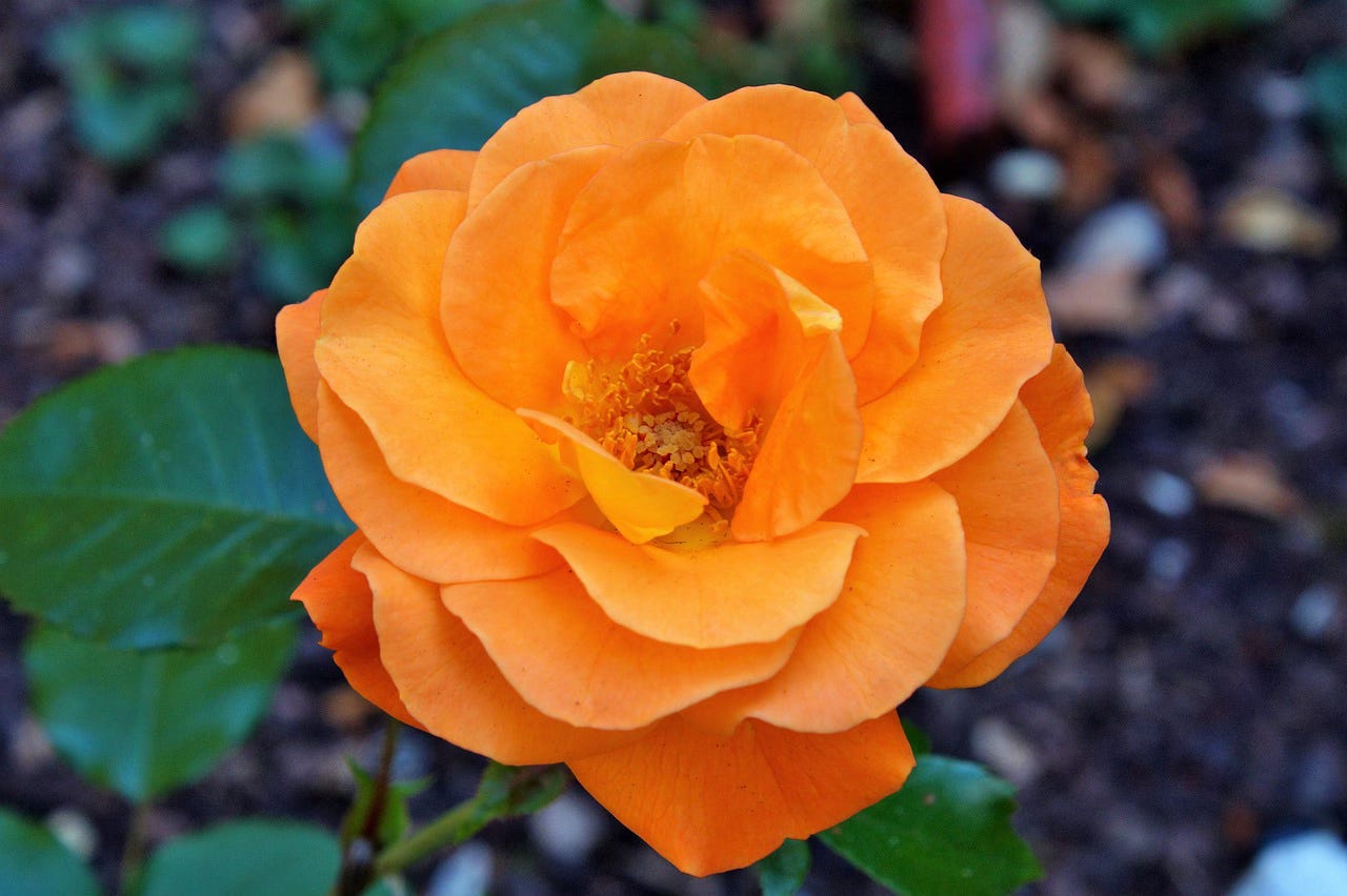
Dragonfly Abha Rajan sent in a great question for the next article in this series. It turns out it isn’t another example of the same challenge we’ve been discussing. It’s a different challenge that also shows up in a lot of paintings: creating a sense of depth or shadow on yellow, orange and pink objects (comes up a lot with flowers).
I’m going to take it up as the topic of the next article in this series (in two weeks).
Here’s what Abha had to say about this challenge:
“I am confused about transparent yellows. I am attaching a photo of a rose I was trying to paint. I got it from Pixabay and it is free to use. (photo credit: https://pixabay.com/de/photos/rose-knospen-blüte-rosenknospe-2481043/)
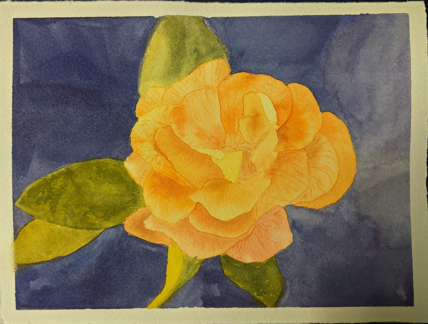
“I am also attaching what I made. It is postcard sized. If you do decide to discuss this topic, please feel free to use my painting if you want to.
“My problem is that my painting looks flat. I was advised to reserve more whites.. but the photo doesn't really have any whites.. Another suggestion I got was that maybe the yellow I was using was too opaque.. and, when I checked, it turned out to be the case. I was using Cadmium yellow pale and Cadmium yellow deep. The red I used also has a high opacity rating. I went and bought yellow colors with a higher transparency rating and I did several tests to compare. I haven't attempted the rose again, but the washes of the similar colors look very similar, as do the oranges when I mix in red. I tried painting over dried black paint, but I can't really tell the difference.
“My thinking is that the problem is that I put in too many layers on the petals. And maybe that's just not such a good idea with such a light color..? Or maybe it's just not such a great picture for watercolor?”
Stay tuned for an article and video on this challenging situation in two weeks.


Omg! I'm in the post! Well I can't stop fluttering my dragonfly wings and zipping around with delight 😁 🤪
Looking at the photo again, I think I could have made the center and some of the shadows darker, but I'm not sure that would solve it.. I made this a few months back and haven't been able to crack the problem, so really appreciate you looking at it.
Thank you for such an in depth video on the current topic! It made me pull out my gouache that has been lying around unused and give the techniques a try.. I think I need some time to get a hang of the consistency though.
I look forward to this next video, I learned a lot of new ideas from the last one with yellow trees. Thank you Lynn. Cant wait to try these new ideas out.